Engage NY Eureka Math 8th Grade Module 6 Lesson 6 Answer Key
Eureka Math Grade 8 Module 6 Lesson 6 Example Answer Key
Example 1.
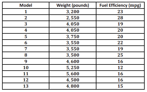
A bivariate data set consists of observations on two variables. For example, you might collect data on 13 different car models. Each observation in the data set would consist of an (x,y) pair.
x: weight (in pounds, rounded to the nearest 50 pounds)
and
y: fuel efficiency (in miles per gallon, mpg)
The table below shows the weight and fuel efficiency for 13 car models with automatic transmissions manufactured in 2009 by Chevrolet.
Eureka Math Grade 8 Module 6 Lesson 6 Exercise Answer Key
Exercises 1–8
Exercise 1.
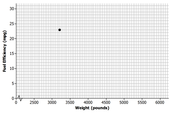
In the Example 1 table, the observation corresponding to Model 1 is (3200,23). What is the fuel efficiency of this car? What is the weight of this car?
Answer:
The fuel efficiency is 23 miles per gallon, and the weight is 3,200 pounds.
Exercise 2.
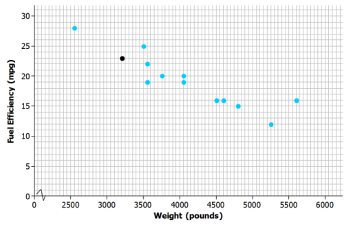
Add the points corresponding to the other 12 observations to the scatter plot.
Answer:
Exercise 3.
Do you notice a pattern in the scatter plot? What does this imply about the relationship between weight (x) and fuel efficiency (y)?
Answer:
There does seem to be a pattern in the plot. Higher weights tend to be paired with lesser fuel efficiencies, so it looks like heavier cars generally have lower fuel efficiency.
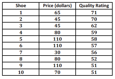
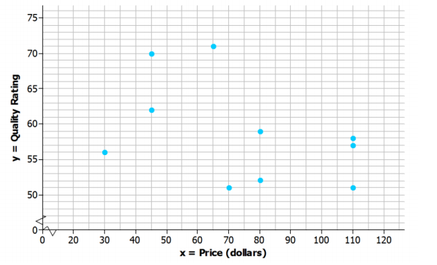
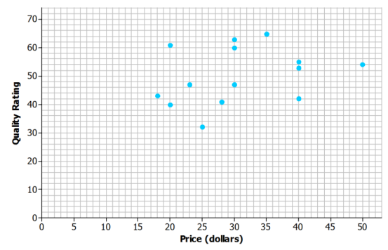
Is there a relationship between price and the quality of athletic shoes? The data in the table below are from the Consumer Reports website.
x: price (in dollars)
and
y: Consumer Reports quality rating
The quality rating is on a scale of 0 to 100, with 100 being the highest quality.
Exercise 4.
One observation in the data set is (110,57). What does this ordered pair represent in terms of cost and quality?
Answer:
The pair represents a shoe that costs $110 with a quality rating of 57.
Exercise 5.
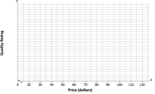
To construct a scatter plot of these data, you need to start by thinking about appropriate scales for the axes of the scatter plot. The prices in the data set range from $30 to $110, so one reasonable choice for the scale of the x-axis would range from $20 to $120, as shown below. What would be a reasonable choice for a scale for the y-axis?
Answer:
Sample response: The smallest y-value is 51, and the largest y-value is 71. So, the y-axis could be scaled from 50 to 75.
Exercise 6.
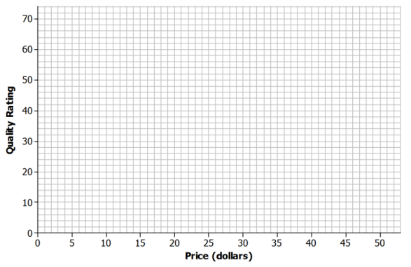
Add a scale to the y-axis. Then, use these axes to construct a scatter plot of the data.
Exercise 7.
Do you see any pattern in the scatter plot indicating that there is a relationship between price and quality rating for athletic shoes?
Answer:
Answers will vary. Students may say that they do not see a pattern, or they may say that they see a slight downward trend.
Exercise 8.
Some people think that if shoes have a high price, they must be of high quality. How would you respond?
Answer:
Answers will vary. The data do not support this. Students will either respond that there does not appear to be a relationship between price and quality, or if they saw a downward trend in the scatter plot, they might even indicate that the higher-priced shoes tend to have lower quality. Look for consistency between the answer to this question and how students answered the previous question.
Exercises 9–10
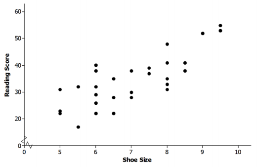
Exercise 9.
Data were collected on
x: shoe size
and
y: score on a reading ability test
for 29 elementary school students. The scatter plot of these data is shown below. Does there appear to be a statistical relationship between shoe size and score on the reading test?
Answer:
Possible response: The pattern in the scatter plot appears to follow a line. As shoe sizes increase, the reading scores also seem to increase. There does appear to be a statistical relationship because there is a pattern in the scatter plot.
Exercise 10.
Explain why it is not reasonable to conclude that having big feet causes a high reading score. Can you think of a different explanation for why you might see a pattern like this?
Answer:
Possible response: You cannot conclude that just because there is a statistical relationship between shoe size and reading score that one causes the other. These data were for students completing a reading test for younger elementary school children. Older children, who would have bigger feet than younger children, would probably tend to score higher on a reading test for younger students.
Eureka Math Grade 8 Module 6 Lesson 6 Problem Set Answer Key
Question 1.
The table below shows the price and overall quality rating for 15 different brands of bike helmets.
Data source: www.consumerreports.org
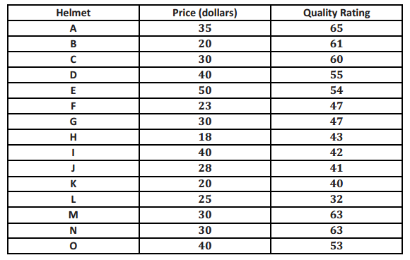
Construct a scatter plot of price (x) and quality rating (y). Use the grid below.
Answer:
Question 2.
Do you think that there is a statistical relationship between price and quality rating? If so, describe the nature of the relationship.
Answer:
Sample response: No. There is no pattern visible in the scatter plot. There does not appear to be a relationship between price and the quality rating for bike helmets.
Question 3.
Scientists are interested in finding out how different species adapt to finding food sources. One group studied crocodilian species to find out how their bite force was related to body mass and diet. The table below displays the information they collected on body mass (in pounds) and bite force (in pounds).
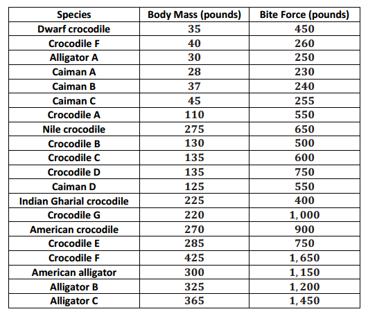
Data Source: http://journals.plos.org/plosone/article?id=10.1371/journal.pone.0031781#pone-0031781-t001
(Note: Body mass and bite force have been converted to pounds from kilograms and newtons, respectively.)
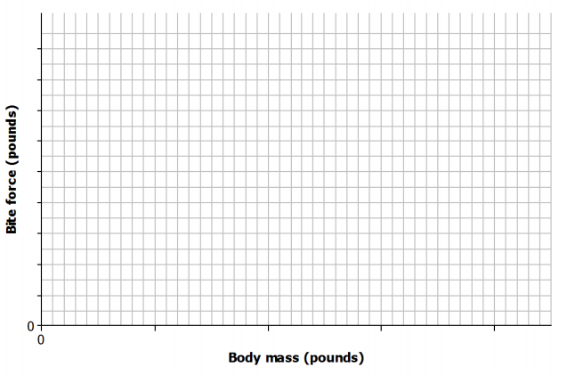
Construct a scatter plot of body mass (x) and bite force (y). Use the grid below, and be sure to add an appropriate scale to the axes.
Answer:
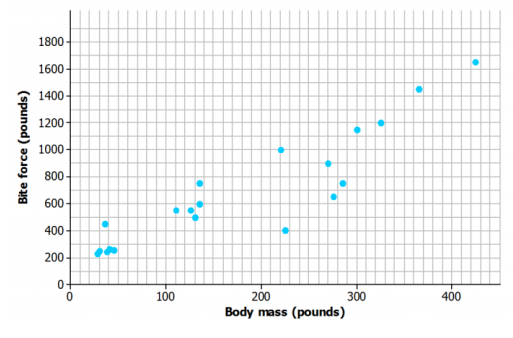
Question 4.
Do you think that there is a statistical relationship between body mass and bite force? If so, describe the nature of the relationship.
Answer:
Sample response: Yes, because it looks like there is an upward pattern in the scatter plot. It appears that alligators with larger body mass also tend to have greater bite force.
Question 5.
Based on the scatter plot, can you conclude that increased body mass causes increased bite force? Explain.
Answer:
Sample response: No. Just because there is a statistical relationship between body mass and bite force does not mean that there is a cause-and-effect relationship.
Eureka Math Grade 8 Module 6 Lesson 6 Exit Ticket Answer Key
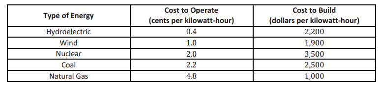
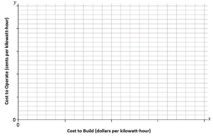
Energy is measured in kilowatt-hours. The table below shows the cost of building a facility to produce energy and the ongoing cost of operating the facility for five different types of energy.
Question 1.
Construct a scatter plot of the cost to build the facility in dollars per kilowatt-hour (x) and the cost to operate the facility in cents per kilowatt-hour (y). Use the grid below, and be sure to add an appropriate scale to the axes.
Answer:
Question 2.
Do you think that there is a statistical relationship between building cost and operating cost? If so, describe the nature of the relationship.
Answer:
Answers may vary. Sample response: Yes, because it looks like there is a downward pattern in the scatter plot. It appears that the types of energy that have facilities that are more expensive to build are less expensive to operate.
Question 3.
Based on the scatter plot, can you conclude that decreased building cost is the cause of increased operating cost? Explain.
Answer:
Sample response: No. Just because there may be a statistical relationship between cost to build and cost to operate does not mean that there is a cause-and-effect relationship.