
The pictorial representation uses images to represent data. Pictograph uses pictures and symbols to present information about the provided data. Pictographs are very comfortable to use, should be used very carefully but sometimes they may lead to misinterpretation of data as well because it doesn’t show the data accurately.
Whenever pictographs are drawn, they should look visually correct as most of the time the data is interpreted visually. In this article, we will also find the definition of pictograph, how to make a pictograph, its advantages with many solved examples.
Also, Read: Construction of Bar Graphs
Pictograph – Definition
In this method, we use images to represent the data. In other words, pictographs are used to define the frequency of the data using images or symbols, which are relevant to the data. The pictograph uses a simple way to represent the data and make it very easy to understand, as it is one of the simplest ways to represent statistical data. In the pictograph, we use a key that represents the value of the symbol. Symbols or images in the pictograph should be of the same size.
Different pictorial representations of data are bar graphs, line graphs, pie charts, and so on are available to easily understand the data.
How to Make a Pictograph?
The steps required to make a pictograph are as follows
- The first step to make a pictograph is the collection of relevant information about the data, which we want to represent. After the data is collected, make a table or a list of data.
- To represent the data, select any images/pictures, or symbols. For example, if the data represents the selling of apples in different months, make use of apple images or some other images which are relevant to the data.
- While representing the data using images, use a key, which signifies the value of the image. While representing the data if the frequency of the data is very high, then one image is not sufficient to represent the data. Thus, we use a key that represents the numerical value, which should be written along with the pictograph.
- While making a pictograph, Two columns are used to represent the category and data. Finally, the pictograph is drawn using symbols/images, which represent the frequency. In some cases, if the frequency is not a whole number, the symbols can also be drawn as fractions.
- After drawing the pictograph, make sure that the images exactly represent data as well as the labeling of the pictograph.
Pictograph Examples
Example 1:
A survey is conducted for the fruits such as apples, pears, grapes, and bananas. No of the votes for the apples are 10. No of the votes for pears are 7.No of votes for the grapes are 2. No of the votes for the bananas are 6. Draw a pictograph for the survey of the fruits.
Solution:
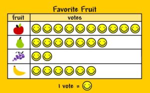
one vote is represented by one smiley symbol. In front of the apple, there are 10 votes. For pears, there are 7 votes. For grapes, there are 2 votes and for bananas, there are 6 votes. Apple has a maximum number of votes of 10. grapes have the least number of votes i.e. 2.
Example 2:
Surya conducted a survey with his friends about the favorite icecreams. One ice cream indicates one person. Find the votes polled for the icecreams and also find the maximum votes and minimum votes polled for the icecreams?
Solution:
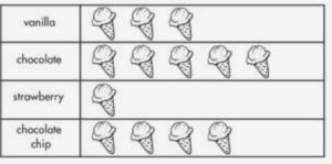
Votes polled for vanilla are 3. 5 votes polled for chocolate ice cream. one vote polled for strawberry and 4 votes polled for chocolate chip. The maximum votes are polled for the chocolate icecreams and the minimum votes polled for the strawberry icecreams.
Advantages of the Pictographs
1. As Pictographs contain images it is very easy to understand.
2. A large amount of information can be expressed in a Simple way through pictographs.
3. Pictographs reduce the need for an explanation since it is used everywhere.
4. At one glance you can say what type of data by seeing the images in the pictograph.
FAQs On Pictographs
1. What is a Pictograph?
The pictographs represent the data using images. In other words, pictographs use images or symbols that represent the frequency of the data
2. What do we use the key in the pictograph?
We use a key, which signifies the value of the image. Sometimes, if the frequency of the data is very high, then one image is not sufficient to represent the data. Thus, the numerical value called “key” is used and should be written along with the pictograph.
3. Write the steps required to make a pictograph?
1. The five steps involved in making pictographs are:
2. The first step is to collect the data
3. Select the image or symbol according to the data and
4. Assign a key.
5. Draw the pictograph and
6. Review the data.
4. What are the different pictorial representations of data?
The different pictorial representations of data are bar graphs, line graphs, pie charts, etc.