Statistics is more important because nowadays we live in the information world and much of this information is determined mathematically by statistics. It helps to use the proper methods to collect the data, employ the correct analyses, and effectively present the results. Basically, statistics is a mathematical discipline to collect data and summarize the data. The study of statistics is the collection, analysis, interpretation, presentation, and organization of data. Check out Statistics Definition, Types, Advantages, Applications, and Examples in the later sections.
Statistics Definition
The main purpose of statistics is to plan the collected data in terms of the experimental designs and statistical surveys. The study of the collection, analysis, interpretation, presentation, and organization of data is called statistics. It will be collecting the data and summarizing the data. If it is studying the population of the country or its economy statistics are used for all such data analysis. Statistics has many applications from small scale to large scale.
Statistics basics including the measure of central tendency and the measure of dispersion. Mean, Median and Mode are central tendencies whereas dispersion comprises variance and standard deviation. Statistics used in many sectors such as psychology, geology, sociology, weather forecasting, probability, and much more. The scope of statistics helps in economic planning, business management, administrations, and research.
Characteristics of Statistics
- Statistics are aggregate facts.
- Statistics are numerically expressed.
- Statistics are collected in a systematic manner.
- Statistics for a predefined purpose.
- Statistics are enumerated or estimated according to reasonable standards of Accuracy.
- Statistics are capable of being placed in relation to each other.
Types of Statistics
Statistics are of two types
- Descriptive Statistics
- Inferential Statistics
Descriptive Statistics: It provides the tool to define our data in a most understandable and appropriate way, the collection of data is described in summary. Descriptive statistics are used on a large scale.
Inferential Statistics: It is about using the data from the sample and then making inferences about the larger population from which the sample is drawn. Inferential statistics are used to explain the descriptive one, it will also be used on a large scale.
Descriptive statistics are transitioned into inferential statistics, it is one more type of statistics.
Representation of Statistics Data
Bar charts, histograms, pie charts, and box plots (box and whiskers plots). Two common types of graphic displays are bar charts and histograms. Both bar charts and histograms use vertical or horizontal bars to represent the number of data points in each category or interval.
Some of the methods involve collecting, summarizing, analyzing, interpreting variables of numerical data. The methods are provided below for representing statistics data.
- Data Collection
- Data Summarization
- Statistical Analysis
In this, the data is a collection of facts, such as numbers, words, measurements, observations, etc. Data are two types is Qualitative data and the second one is Quantitative data. Descriptive data is called Qualitative data whereas Numerical data is Quantitative data, again it has two types.
- Discrete data
- Continuous data.
Discrete data is in form of digital that means zero’s and ones, it has a particular fixed value. so, discrete data can be counted whereas continuous data is not counted because it won’t have a particular fixed value but continuous data has a range of data, so it can be measured.
The representation of statistics data as follow :
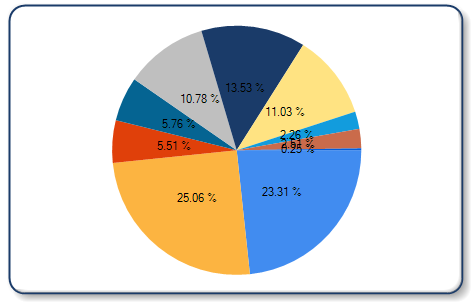
Pie Chart: Pie charts are used in data handling and are circular charts divided up into segments that each represent a value. Pie charts are divided into sections or slices to represent a value of different sizes. The pie chart has different parts are Title, Legend, Source, and data. The title offers a short explanation of what is in your graph and legend tells what each slice represents, source explains where you found the information that is in your graph.
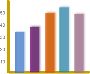
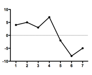
Bar Graph: A bar graph is a chart that plots data using rectangular bars or columns called bins, that represents the total amount of observations in the data for that category. Bar graphs are commonly used in financial analysis for displaying data. In other words, Bar graphs are used to compare things between different groups or to track changes over time.
Bar Graphs are three types :
- Horizontal Bar Graphs
- Vertical Bar Graphs
- Line Graph
Bar Graphs have different parts such as Title, Source, X-Axis, Y-Axis, Data, and Legend.
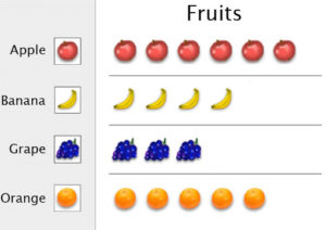
 Pictogram: A Pictogram is one of the simplest and most popular forms of data visualization out there. Also known as “pictographs”, “icon charts”, “picture charts”, and “pictorial unit charts”, pictograms use a series of repeated icons to visualize simple data.
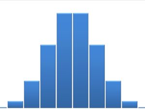
 Histogram: A histogram is a display that indicates the frequency of specified ranges of continuous data values on a graph in the form of immediately adjacent bars. Interval is a range of data in a data set. The different types of a histogram are uniform histogram, symmetric histogram, bimodal histogram, probability histogram.
Frequency Distribution: Frequency distribution in statistics is a graph or data set organized to show the frequency of occurrence of each possible outcome of a repeatable event observed many times. The frequency of a data value is represented by ‘f’. There are three types of frequency distributions:
- Grouped Frequency distribution.
- Ungrouped Frequency distribution.
- Cumulative Frequency distribution.
- Relative Frequency distribution.
- Relative cumulative Frequency distribution.
FAQ’s on Real Life Statistics
1. What are the applications of Statistics?
A. Some of the applications of Statistic are listed below :
- Statistics applied to Theoretical Statistics and Mathematical Statistics
- Statistics in society
- Statistical computing
- Machine learning and data mining.
2. How many types of Statistics, namely?
Statistics are two types, namely
- Descriptive Statistics
- Inferential Statistics
3. What is Statistics?
The study of the collection, analysis, interpretation, presentation, and organization of data is called statistics.
4. What are the types of Bar Graphs?
Bar graphs are commonly used in financial analysis for displaying data. Bar graphs are used to compare things between different groups or to track changes over time. There are 3 types of bar graphs namely:
- Horizontal Bar Graphs
- Vertical Bar Graphs
- Line Graph
5. How to represent data on Statistics?
In Statistics, the data can be represented by using pie charts, bar graphs, histograms, pictograms, line graph,s and frequency distribution. Data will be two types one is qualitative and another one is quantitative. Descriptive data is called Qualitative data whereas Numerical data is Quantitative data. Again quantitative data has two types those are discrete and continuous.