
A bar graph is a method of representing data using vertical or horizontal rectangular bars. It is a graphical representation of grouped data using the bars of different heights. Bar graphs are also known as bar charts. The collection, presentation, analysis, organisation and interpretation of data is called statistics. The statistical data can be represented in multiple ways like tables, bar charts, histograms, piecharts, etc. Here, 5th grade students will learn about the bar chart definition, types, uses, advantages, and solved questions.
What is a Bar Graph?
A bar graph is a pictorial representation of data in the form of horizontal or vertical bars, where the length of bars are proportional to the measure of data. Bar charts are an excellent tool for representing data that is independent of one another and doesn’t require to be in a specific order.
The bars drawn are of uniform width and variable quantity is represented on one of the axes. The lengths or heights of the bars is the value of the variable and are used to compare quantities. The major attributes of bar charts are along the lines:
- Bar graph helps to compare the different sets of data among the different groups.
- The chart shows the major changes in data over time.
- The graph gives the relationship using two axes, category name on one axis, discrete values on the second axis.
Types of Bar Graph
The bar graphs can be horizontal or vertical. The important feature of the bar graph is its length. If length is more means the values are more than the given data. It shows categorical, numerical data arranged in class intervals. The bars show the frequencies of distinctive values of commonly the distinct values themselves. The types of bar graphs are as follows:
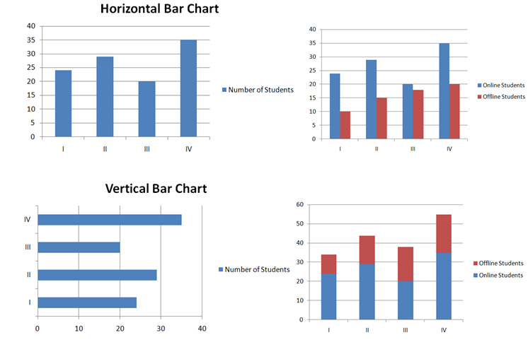
- Vertical bar chart
- Horizontal bar chart
The bars in the graph can be plotted vertically or horizontally, but the most used bar graph is the vertical bar graph. Apart from the horizontal and vertical bar graphs, there are two more types.
- Grouped Bar Graph
- Stacked Bar Graph
Vertical Bar Graph: If the grouped data is represented vertically in a graph using the bars and the bars gives the measure of data, such graphs are called vertical bar graphs.
Horizontal Bar Graph: If the grouped data is represented horizontally in a chart using the bars, then those graphs are called horizontal bar graphs and bars represent the measure of data.
Grouped Bar Graph: It is also called the clustered bar graph that is used to represent discrete values for more than the single object that shares the same category. Here, the total number of instances are combined into a single bar. The grouped bar graph is a type of bar graph in which different sets of data items are compared.
Stacked Bar Graph: It is also called the composite bar chart that divides the aggregate into various parts. In this type of bar graph, each part is represented using different colours, which helps to identify the different categories.
The below image explains all the types of bar charts.
Uses of Bar Graphs
Bar graphs are used to compare things between different groups or trace changes over a period of time. These are more suitable to estimate change over time.
Bar charts contain the discrete domains of divisions that are normally scaled so the data can fit on the graph. The charts organized from the highest to the lowest number are called Pareto charts.
Bar Graphs Properties
The properties of bar graphs are as follows:
- Each column in the bar graph should have equal width.
- The distance between all bars should be the same.
- All the bars must have a common base.
- The height of the bar should correspond to the data value.
Difference Between Bar Graph and Histograms
The important difference between the bar graph and histogram is the bar charts are not adjacent to each other but in the histogram, the bars are adjacent. Simply, a bar graph is the graphical representation o the data with the help of rectangular bars with equal gaps between them whereas a histogram is a graphical representation of data using rectangular bars with no gap between the bars.
How to Make a Bar Graph?
The following are the steps to construct a bar graph easily.
- Based on the information, decide the title of the bar graph.
- Draw the horizontal axis, vertical axis.
- Lable the horizontal axis as the category name.
- Mention the data values at the vertical axis and label them.
- Finalise the scale range of the given data
- Draw the bar graphs that represent each category with the respective numbers.
Pros and Cons of Bar Graphs
Advantages:
- Bar graph optimizes the large set of data in visual form.
- It helps in estimating the key values at a glance.
- Displays each category of data in a frequency distribution.
- It clarifies the trend f data better than the table.
Disadvantages:
- Bar graphs can easily be manipulated to yield fake information.
- Sometimes, it fails to reveal the effects, patterns, etc.
Example Questions on Bar Graphs
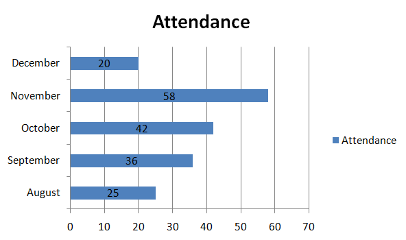
Question 1:
The average monthly attendance of a class is given here:
| Month | August | September | October | November | December |
|---|---|---|---|---|---|
| Attendance | 25 | 36 | 42 | 58 | 20 |
Draw the bar graph for the given data.
Solution:
Take attendance values on the x-axis, month on the y-axis.
Draw rectangular bars representing the attendance at equal intervals.
Question 2:
The weekly sale of ruled notebooks in a stationary shop is given here. Represent the given information on a bar graph.
| Days | Mon | Tues | Wed | Thurs | Fri | Sat |
|---|---|---|---|---|---|---|
| Ruled Notebooks Sold | 16 | 18 | 10 | 15 | 15 | 8 |
(i) Write the title of the bar chart.
(ii) On which day were the maximum notebooks sold?
(iii) Which two days have an equal number of sales?
Solution:
Take the number of ruled notebooks sold at the stationery shop on the x-axis, week on the y-axis.
Draw rectangular bars representing the number of notebooks sold at equal intervals.
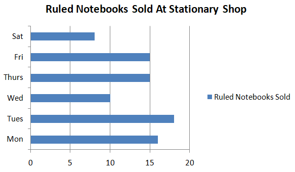
(i) The name of the bar graph is the number of ruled Notebooks sold at a stationery shop.
(ii) On Tuesday, the maximum number of notebooks were sold.
(iii) Thursday and Friday have the same number of sales.
Frequently Asked Question’s on Bar Graph
1. What is histogram vs bar graph?
Histograms are used to represent distributions of variables and bar graphs are used to compare variables. Histograms present numerical data while the bar graphs show categorical data.
2. What is a bar graph?
A bar graph is made up of columns that are plotted on a graph. The height of the column in a bar graph indicates the size of the group. The columns positioned over the label are used to show the categorical variable.
3. How are bar graphs used in real life?
Various businesses use the bar graphs to present information related to sales, customers, employees and other businesses. People can also use this bar chart for personal reasons to trace the finances in a year.
4. What are the advantages of bar graphs?
The bar graph shows each data category in a frequency distribution. It estimates key values at a glance. Permit a visual check of the accuracy and reasonableness of calculations and summarize large data in visual form.