Bar graphs are one of the pictorial representations of data that can represent using vertical or horizontal rectangular bars. The length of the bars is always are proportional to the measure of given data. Bar graphs are also known as bar charts also are one of the data handlings in statistics. Students can know how to Represent Data on a Bar Graph by going through the complete article.
Do Refer Similar Articles:
Bar Graph
The variable quantity represents on one axis and the measure of the variable is mention on other axes. All the heights and lengths of the bars show the value of the variable and compare different quantities. There are three major attributes of bar graphs mentioned below. They are
(i) The bar graph shows the relationship between two axes where one represents a category and the other one represents discrete values.
(ii) Also, it helps to compare different sets of data among different groups.
(iii) The bar graph data shows the major changes of data over time.
Types of Bar Graph
Representation of Data on a Bar Graph can be vertical or horizontal. The main and important feature of any bar graph is its length or height. If the length of the bar graph is high, then the values are higher than any given data. The number of values on the x-axis or y-axis of a column is called the scale. The bar graphs consist of an axis and a series of labeled vertical or horizontal bars. Check out the construction of bar graphs to know in detail.
Vertical Bar Graph
The vertical bars are placed on a graph or chart to represent the data where the bars represent a measure of data are known as vertical bar graphs. The data represents along the y-axis and the height of the bars displays the values.
Vertical Bar Graph Example
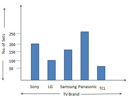
1. Draw a vertical bar graph based on the given data.
| TV | Sony | LG | Samsung | Panasonic | TCL |
|---|---|---|---|---|---|
| No. of sets manufactured on a certain day | 200 | 100 | 150 | 250 | 50 |
Solution:
From the given information, the data shows that the TV and No. of sets manufactured on a certain day.
1. Gather the given information.
2. Place the TV sets on the X-axis and No. of sets manufactured on a certain day on the y-axis.
3. Draw a vertical bar graph according to the number of sets of values on the y-axis.
Horizontal Bar Graphs
The Horizontal bars are placed on a graph or chart to represent the data where the bars represent a measure of data are known as Horizontal Bar Graphs. The data represents along the x-axis and the length of the bars displays the values.
Horizontal Bar Graph Examples
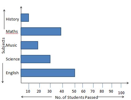
1. Draw a horizontal bar graph based on the following data.
| Subjects | English | Science | Music | Maths | History |
|---|---|---|---|---|---|
| No. of students passed | 50 | 30 | 20 | 40 | 10 |
Solution:
From the given information, the data shows that the Subjects and No. of students passed.
1. Gather the given information.
2. Place the Subjects on the Y-axis and No. of students passed on the y-axis.
3. Draw a horizontal bar graph according to the No. of students passed on the x-axis.
Grouped Bar Graph
The grouped bar graph is also known as the clustered bar graph. It is used to represent the different objects that share the same category. In a grouped bar graph, the total number of instances is combined into a single bar. Every single bar represents a different color. The grouped bar graph can represent using both vertical and horizontal bar charts.
Stacked Bar Graph
The stacked bar graph is also known as the composite bar chart that can divide the aggregate into different parts. Every part represents a different category and each category having a different color. Also, it consists of specific labeling to show the different parts of the bar.
Want to get more excellence in solving math fundamentals at primary standard? Avail our comprehensive collection of Worksheets, Practice Tests, Word Problems on 4th Grade Math and students can learn great mathematics tricks in no time.
Properties of Bar Graph
Let us have a look at some of the important properties of a bar graph.
- The distance between each and every bar should be the same.
- The height of the bar shows the data value.
- All the bars must have a common base.
- Each column in the bar graph should have equal width.
Uses of Bar Graphs
Bar graphs are used to represent the changes over time. It is very helpful to use bar graphs to show bigger changes over time. Bar charts can arrange in order to represent the data values.
Advantages of Bar Chart
The main advantages of the bar chart are given below. Check them out now.
- The Bar graph shows the large set of data in simple visual form.
- It shows the data better than a table.
- Each category of data can appear in the frequency distribution.
- It helps in estimating the key values at a glance.
How to Draw a Bar Graph?
Follow the below steps to draw a Bar Graph. The visual representation of the bar graph for given data is easy if you follow these steps.
1. Firstly, select the title of the bar graph.
2. Draw the horizontal and vertical axis.
3. Then, label the horizontal axis.
4. After that label the vertical axis.
5. Mention the scale range for the given data.
6. Finally, draw the bar graph with the given information.
Frequently Asked Questions on Bar Graph
1. What is a bar graph?
A bar graph or Bar chart is the graphical representation of the data using rectangular bars. The bar graph represents the comparison between different categories.
2. What are the different types of bar graphs?
There are four types of bar graphs available. They are
- Vertical bar graph
- Horizontal bar graph
- Grouped bar graph
- Stacked bar graph
3. When to use a horizontal bar chart?
The horizontal bar chart is better to represent nominal variables.
4. When to use a vertical bar chart?
The vertical bar chart is better to represent ordinal variables.