Engage NY Eureka Math Algebra 1 Module 2 Lesson 1 Answer Key
Eureka Math Algebra 1 Module 2 Lesson 1 Example Answer Key
Example: Graphs
Data are often summarized by graphs; the graphs are the first indicator of variability in the data.
→ DOT PLOTS: A plot of each data value on a scale or number line.
→ HISTOGRAMS: A graph of data that groups the data based on intervals and represents the data in each interval by a bar.

→ BOX PLOTS: A graph that provides a picture of the data ordered and divided into four intervals that each contains approximately 25% of the data.
Review the different types of graphs that students have previously studied (dot plots, box plots, and histograms). Convey the following:
→ Think of each graph as telling a story.
→ Graphs of distributions are often the starting point in understanding the variability in the data.
→ The graphs in the following exercises are analyzed in more detail in the lessons that follow.
Eureka Math Algebra 1 Module 2 Lesson 1 Exercise Answer Key
Exercises
Answer the questions that accompany each graph to begin your understanding of the story behind the data.
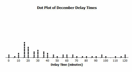
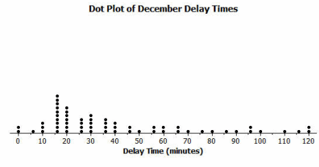
Transportation officials collect data on flight delays (the number of minutes past the scheduled departure time that a flight takes off).
Consider the dot plot of the delay times for sixty BigAir flights during December 2012.
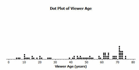
A random sample of eighty viewers of a television show was selected. The dot plot below shows the distribution of the ages (in years) of these eighty viewers.
Question 1.
What do you think this graph is telling us about the flight delays for these sixty flights?
Answer:
Most flights are delayed for 15 minutes; some are delayed for a longer time.
Question 2.
Can you think of a reason why the data presented by this graph provide important information? Who might be interested in this data distribution?
Answer:
If flights are late, travelers would not select this airline.
BigAir and travelers using this airline would be interested in this information.
Question 3.
Based on your previous work with dot plots, would you describe this dot plot as representing a symmetric or a skewed data distribution? (Recall that a skewed data distribution is not mound shaped.) Explain your answer.
Answer:
Skewed; it has a tail to the right. (Students are introduced to this in Grade 6.)
A random sample of eighty viewers of a television show was selected. The dot plot below shows the distribution of the ages (in years) of these eighty viewers.
Question 4.
What do you think this graph is telling us about the ages of the eighty viewers in this sample?
Answer:
The typical age of viewers is between 60 and 70 years old; the show appeals to a wide range of ages.
Question 5.
Can you think of a reason why the data presented by this graph provide important information? Who might be interested in this data distribution?
Answer:
These data are important in understanding the audience of the show. If the show is paid for by commercials, then the distribution is important for sponsors.
Question 6.
Based on your previous work with dot plots, would you describe this dot plot as representing a symmetric or a skewed data distribution? Explain your answer.
Answer:
Skewed; it has a tail to the left.
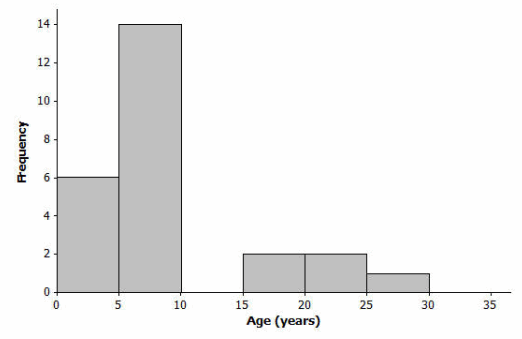
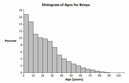
The following histogram represents the age distribution of the population of Kenya in 2010.
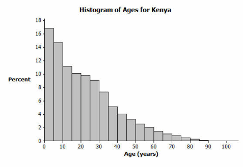
Question 7.
What do you think this graph is telling us about the population of Kenya?
Answer:
A large percentage of the people in Kenya are ages 10 or younger.
Question 8.
Why might we want to study the data represented by this graph?
Answer:
It tells us about Kenya and its challenges based on its population and demographics. It is important to understand the data because it may lead to finding the reason(s) as to why these data are occurring—which could lead to solutions.
Question 9.
Based on your previous work with histograms, would you describe this histogram as representing a symmetrical or a skewed distribution? Explain your answer.
Answer:
Skewed; it has a tail to the right.
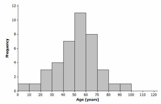
The following histogram represents the age distribution of the population of the United States in 2010.
Question 10.
What do you think this graph is telling us about the population of the United States?
Answer:
The percentage of the population is about the same in each interval until the age range of 60 to 65 years old. Then, the percentages decline.
Question 11.
Why might we want to study the data represented by this graph?
Answer:
Population data are used to determine health-care challenges (for 65 years and older) or education challenges (for 0 to 20 years old). Businesses (such as insurance companies) use this type of data.
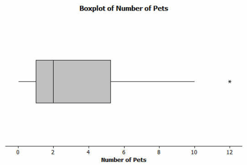
Thirty students from River City High School were asked how many pets they owned. The following box plot was prepared from their answers.
Question 12.
What does the box plot tell us about the number of pets owned by the thirty students at River City High School?
Answer:
50% of students own between 1 and 5 pets.
Question 13.
Why might understanding the data behind this graph be important?
Answer:
Understanding the data is important for planning special events involving pets and understanding interests of a group of people.
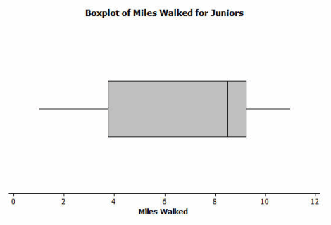
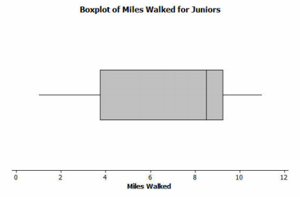
Twenty-two juniors from River City High School participated in a walkathon to raise money for the school band. The following box plot was constructed using the number of miles walked by each of the twenty-two juniors.
Question 14.
What do you think the box plot tells us about the number of miles walked by the twenty-two juniors?
Answer:
50% of the juniors walked between 4 and 9 miles; 25% walked between 1 and 4 miles; 25% walked between 9 and 11 miles.
Question 15.
Why might understanding the data behind this graph be important?
Answer:
They provide an indication of the participation of the junior class. Sponsors of the event may be interested in the data.
Eureka Math Algebra 1 Module 2 Lesson 1 Problem Set Answer Key
Question 1.
Twenty-five people were attending an event. The ages of the people are as follows:
3, 3, 4, 4, 4, 4, 5, 6, 6, 6, 6, 6, 6, 6, 7, 7, 7, 7, 7, 7, 16, 17, 22, 22, 25.
a. Create a histogram of the ages using the provided axes.
b. Would you describe your graph as symmetrical or skewed? Explain your choice.
Answer:
This graph is skewed with a tail to the right. Most of the ages are in the younger intervals.
c. Identify a typical age of the twenty-five people.
Answer:
A typical age could be any age in the interval of 5 to 10, such as 6 or 7 years old.
d. What event do you think the twenty-five people were attending? Use your histogram to justify your conjecture.
Answer:
The 22 ages were obtained from a story-time hour at a library. Most of the ages were the children attending the event. The older ages represent some of the caretakers and the storytellers. Discuss any conjectures in which the younger age intervals would likely represent most of the people attending the event, with some older people to help out with the event.
Question 2.
A different forty people were also attending an event. The ages of the people are as follows:
6, 13, 24, 27, 28, 32, 32, 34, 38, 42, 42, 43, 48, 49, 49, 49, 51, 52, 52, 53,
53, 53, 54, 55, 56, 57, 57, 60, 61, 61, 62, 66, 66, 66, 68, 70, 72, 78, 83, 97.
a. Create a histogram of the ages using the provided axes.
b. Would you describe your graph of ages as symmetrical or skewed? Explain your choice.
Answer:
This histogram is nearly symmetrical.
c. Identify a typical age of the forty people.
Answer:
A typical age is approximately 55 years old.
d. What event do you think the forty people were attending? Use your histogram to justify your conjecture.
Answer:
The ages were obtained from people attending a family reunion. This is obviously not necessarily what you would expect from all family reunions. Discuss any conjectures in which a nearly symmetrical data distribution of ages could be a possibility.
e. How would you describe the differences in the two histograms?
Answer:
The two age distributions differ primarily in shape (skewed and symmetrical) and in center (typical age).
Eureka Math Algebra 1 Module 2 Lesson 1 Exit Ticket Answer Key
Question 1.
Sam said that a typical flight delay for the sixty BigAir flights was approximately one hour. Do you agree? Why or why not?
Answer:
Most of the flight delays are less than 60 minutes; therefore, 60 minutes is not a typical description of how many minutes a flight is delayed.
Question 2.
Sam said that 50% of the twenty-two juniors at River City High School who participated in the walkathon walked at least ten miles. Do you agree? Why or why not?
Answer:
It would not be accurate to indicate that 50% walked 10 or more miles. The upper quartile indicates that 25% of the 22 students walked 9 or more miles.
Question 3.
Sam said that young people from the ages of 0 to 10 years old make up nearly one-third of the Kenyan population. Do you agree? Why or why not?
Answer:
I do agree with Sam. The first two bars of the Kenya graph represent people between 0 and 10 years old. The first bar represents approximately 17% of the population (0–5 year olds), and the second bar represents approximately 15% of the population (5–10 year olds). Therefore, approximately 32%, or nearly one-third of the Kenyan population, is between 0 and 10 years old.