
Interpreting Bar Graph tells you how to collect the information from the bar chart. We have included different examples to explain the reading and interpretation of bar graphs. Also, every bar graph is explained with clear steps so that you can answer any kind of problem asked in your exams quite easily. Understand the construction of bar graphs and different types of bar graphs by referring to our other articles.
Also, Refer:
- Represent Data on a Bar Graph
How to Interpret Bar Charts in Statistics? | Steps in Interpreting Bar Graphs
Follow the below steps to understand the data from a given Bar Graph.
1. Firstly, take the given bar graph you need to analyze.
2. Analyze the bar graph type.
3. Understand what data the bar graph represents.
4. Then, analyze different data and every rectangular graph available in a bar graph.
5. Finally, separate the information from the bar graph and answer all the related questions.
Features of a Bar Chart
Below are the some of the Features of a Bar Graph.
- The Bar chart shows the large set of information in simple visual form.
- It helps in estimating the key values at a glance.
- It is better to represent the data than a table.
- Each category of data can appear in the frequency distribution.
You can find all the important 4th Grade Math Topics by visiting our website. Practicing with our articles can help you get good scores in exams.
Interpreting Bar Graphs Examples
Example 1.
Evaluate the below bar graph and answer the following questions. The below bar graph compares the lunch options available in the college cafeteria to the number sold during one week.
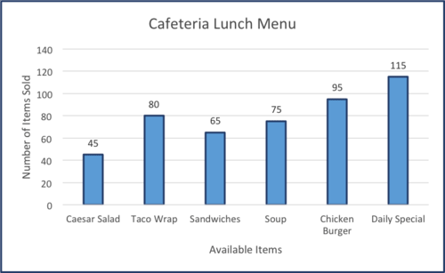
(i) How many sandwiches sold out from the Cafeteria lunch menu?
(ii) Which item sold high in between Chicken Burger and Taco Wrap?
(iii) Which item sold less in the Cafeteria lunch menu?
Solution:
Given Cafeteria lunch menu is
Caesar Salad – 45
Taco Wrap – 80
Sandwiches – 65
Soup – 75
Chicken Burger – 95
Daily Special – 115
(i) 65 sandwiches are sold out from the Cafeteria lunch menu.
(ii) Chicken Burger – 95 and Taco Wrap – 80
95 > 80.
Therefore, Chicken Burger is the most purchased from the Cafeteria lunch menu compared to Taco Wrap.
(iii) Caesar Salad items sold less in the Cafeteria lunch menu.
Example 2.
The Given bar graph is often drawn with two or more bars in each category. The following bar graph shows the temperature in degrees Fahrenheit for the third week of May for the years 2001 and 2016 respectively. Observe the bar graph to answer the questions presented below the graph.
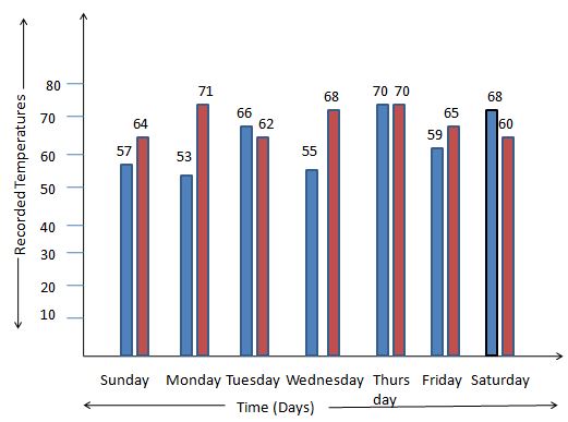
(i) What was the highest recorded temperature in the year 2001?
(ii) What is the lowest temperature recorded for the year 2016?
(iii) What is the average daily temperature for the week displayed on the bar graph for each year?
Solution:
The temperature in degrees Fahrenheit for the third week of May from the years 2001 and 2016.
(i) The temperatures recorded in the 2001 year are 57, 53, 66, 55, 70, 59, 68.
70 is the highest temperature.
Therefore, the highest recorded temperature in the year 2001 is 70 degrees Fahrenheit.
(ii) The temperatures recorded in the 2016 year are 64, 71, 62, 68, 70, 65, 60.
60 is the lowest temperature.
Therefore, the lowest recorded temperature in the year 2016 is 60 degrees Fahrenheit.
(iii) The average daily temperature for the week displayed on the bar graph for each year is
The answer is 61.1 degrees Fahrenheit for the year 2001.
The answer is 65.7 degrees Fahrenheit for the year 2016.
Example 3.
Sam asked some students how they traveled to school. She drew this bar chart to show the results.
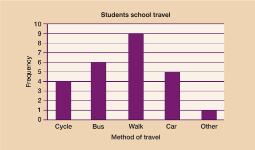
(i) Which method of travel was used most by the students?
(ii) How many students did Sam ask in total?
(iii) How many more students walked to a school than cycled to school?
Solution:
Given that some students traveled to school.
(i) The most used method of traveling to school is Walking.
(ii) To find out the total number of students, add the amount.
4 + 6 + 9 + 5 + 1 = 25 students in total.
(iii) Students who walked = 9.
Students who cycled = 4.
To find out how many more you do by subtracting the number of students who cycled from Students who walked.
9 – 4 = 5 more students walked than cycled.
FAQs on Interpreting Bar Graph
1. Mention the different types of bar graphs?
The different types of bar graphs are
(i) Stacked bar graph
(ii) Grouped bar graph
(iii) Vertical bar graph
(iv) Horizontal bar graph
2. What are the steps in interpreting bar graph?
The steps to interpret a bar graph are
1. Take the given bar graph you need to analyze.
2. Check out the bar graph type.
3. Understand what data the bar graph represents.
3. Analyze different data and every rectangular graph available in a bar graph.
4. Separate the information from the bar graph and answer all the related questions.
3. What is the use of a bar graph?
The use of a bar graph is to show the data in a visual form which changes over time. Bar graph helps to show a large amount of data into a visual representation.