A line graph is a different graph that is generally used in statistics. It represents a change in a quantity with respect to other quantities. The line graph is also called the linear graph. Here, 5th Grade Math students will learn about what is a line graph, how to construct a line graph, its types, uses, parts, and many more in one place. Also, get the example questions with solutions on a line chart and double line graph.
What is Line Graph?
A line graph is a graph that represents information that is connected in some way (such as changes over time). These graphs have two axes namely the x-axis or horizontal axis and the y-axis or vertical axis. We plot line graphs using various points connected through straight lines. The line graph is also known as a line chart.
If the relation including any two measures can be expressed using a straight line in a graph, then those graphs are called linear graphs. Linear graphs compare two variables in two axes.
Parts of a Line Graph
The line graph has two perpendicular axes that meet at a point called origin (0, 0). Each axis is labeled with a data type. Data points are plotted and connected by a line in a dot to dot fashion. The different parts of a line chart are as follows:
- Title: The title of the line graph tells what the graph is all about.
- Scale: It is the numbers that explain the units used on the graph.
- Labels: The side and bottom of the graph have a label that indicates the type of data represented on the graph. the x-axis has the data points and the y-axis has the numeric value for each point on the line.
- Points: The points in the graph represents the ordered pairs. A line graph has at least 2 points.
- Lines: Straight line that connects points.
Types of Line Graphs
The below-mentioned are the types of line graphs.
- Simple Line Graph: It has only one line plotted on the graph.
- Multiple Line Graph: Here, more than one line is plotted on the same set of axes. It can effectively compare similar items over the same time.
- Compound Line Graph: When the information is subdivided into two or more types of data, then it is called the compound line graph.
Straight Line Graph
A line graph is a graph formed by segments of straight lines that join the plotted points that represents the data. The line graph is used to solve changing conditions, over a time interval.
Horizontal Line Graph
These are the graphs where the horizontal line extends from each data point parallel to the x-axis. It is also called the row graph.
Vertical Line Graph
The graphs in which a vertical line extends from each data point down to the horizontal axis. It is also called the column graph. The line parallel to the y-axis is called the vertical line.
Also, See:
How to Create a Line Graph?
The following are the simple steps that are helpful to plot a line graph.
- Draw x-axis, y-axis on the graph paper.
- Determine the title of the graph.
- Find the scale.
- Label the vertical axis, the horizontal axis with the respective factors.
- Mark the exact points on the graph and join those points.
Reading a Line Graph
Here you can get the points on how to read a line graph.
- Firstly, observe both axes and understand what they tell about.
- Look at the graph and find the values of points located in the graph.
- Follow the points and determine whether there is any kind of rise or fall. Also, check for the repeated patterns and if there are lines meeting. This way, you will know the purpose of the line graph.
Line Graph Uses
The line graph is used to track the changes over a short and long period of time. It can also be used to compare the changes over the same period of time for different groups. It is better to use a line graph than a bar graph if there are small changes.
Scattered Plot Vs Line Graph
The difference between scatter plot and line graph is given here. The line graph shows continuous data over a period and connects individual data points, ideal for showing the growth rates or trends at even intervals. The scatter plot works best to compare large numbers of data points without regard to time. This is effective to represent the relationship between two variables. In a line graph, the axes show the test and scatter plot axes sow numbers. A line graph cannot handle a large amount of data but a scatter plot manages a large amount of data.
Advantages and Disadvantages of Line Graph
Advantages:
- These are common and effective charts because they are simple, efficient, and easy to understand.
- It is useful to show changes and trends over different time periods.
- It is also helpful to represent small changes that are difficult in other graphs.
- More than one line can be plotted on the same axis for the purpose of comparison.
- It is useful to highlight anomalies within and across data series.
Disadvantages:
- Drawing too many lines over the graph makes it clumsy.
- Line graphs are inconvenient if you have to plot decimal numbers or fractions.
- A wide range of data is challenging to plot over a line graph.
- Line graphs are only ideal for representing data that have numerical values.
Double Line Graph
A double line graph is a graph with two lines. It is a graph that compares two different things over a period of time. It shows how things change over a period of time. It has two lines in one chart and it is used to compare trends & patterns between two subjects.
Steps to construct a Double Line Graph:
- Draw and label the axes.
- List -each item and locate points on the graph for both lines
- Connect the points with line segments separately.
- Draw two line graphs in one chart.
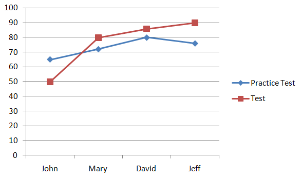
The image shows the double line graph.
Questions on Line Chart
Question 1:
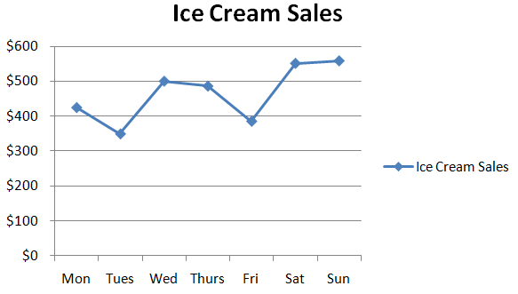
The number of ice cream sales of a store are given here. Draw the line graph for the data.
| Week | Mon | Tues | Wed | Thurs | Fri | Sat | Sun |
|---|---|---|---|---|---|---|---|
| Sales | $425 | $350 | $500 | $486 | $386 | $551 | $558 |
Solution:
The title of a line graph is the ice cream sales in a week.
Scale on y-axis is 1 unit = $100 units
Label the vertical axis as sales and, the horizontal axis as the week.
Mark the exact points on the graph and join those points.
Question 2:
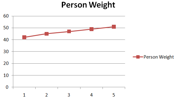
The weight of a person for 5 consecutive years is tabulated here. Draw a line graph for the data.
| Year | 1 | 2 | 3 | 4 | 5 |
|---|---|---|---|---|---|
| Weight in kgs | 42 | 45 | 47 | 49 | 51 |
Solution:
The title of a line graph is the person’s weight in a period of 5 years.
Scale on the y-axis is 1 unit = 10 units
Label the y-axis as weight in kgs and the x-axis as the year.
Mark the exact points on the graph and join those points.
FAQ’s on Line Graph
1. What is a line graph?
A line graph is a type of chart that shows data that changes over a period of time.
2. What are the types of line graphs?
The 3 main types of line charts are simple line graph, multiple line graph and compound line graph.
3. What is the line graph used for?
The line graphs are used to trace changes over long and short periods of time/
4. What are the 4 parts of a line graph?
The four different parts of a line graph are title, scale, labels, and data values.