Use the 5th Grade Data Handling Worksheet to learn how the data represents with images. Worksheets on 5th Grade Data Handling provided here have different questions on bar graphs, pictographs, line graphs, etc. It is the best choice for every student to use our data handling exercise for class 5 pdf to crack the exam easily. The complete concept can easily understand by the students with our quizzes for grade 5 on data handling. Therefore, follow the step-by-step procedure given here to learn all the 5th Grade Data Handling problems.
Also, find:
- Worksheet on Pictograph and Bar Graph
- Worksheet on Representing Data on Bar Graph
- Interpreting Bar Graph
Data Handling Class 5 Questions PDF
1. Observe the below pictograph about how many cars were sold in five months of a year. One car represents 4 cars.
| The month in a Year | Number of Cars |
|---|---|
| Jan | |
| Feb | |
| Mar | |
| Apr | |
| May |
(i) How many cars were sold in different months?
(ii) In which month was the maximum number of cars sold?
(iii) In which month was the minimum number of cars sold?
(iv) How many more cars were sold in May than Apr?
(v) How many total cars were sold in five months?
Solution:
We can get the information from the given pictograph. From the given information, every car is equal to the 4 number of cars.
(i) In Jan, the number of car images = 3.
January 3 x 4 = 12 cars.
In Feb, the number of car images = 2.
February 2 x 4 = 8 cars.
In Mar, the number of car images = 4.
March 4 x 4 = 16 cars.
In Apr, the number of car images = 1.
April 1 x 4 = 4 cars.
In May, the number of car images = 6.
May 6 x 4 = 24 cars.
(ii) In May month, the maximum number of cars (24) were sold.
(iii) In Apr month, the minimum number of cars (4) were sold.
(iv) 20 more cars were sold in May than April. 24 – 4 = 20 cars.
(v) 12 cars + 8 cars + 16 cars + 4 cars + 24 cars = 64 cars.
2. Choose the right answer to show the type of graph that will be used for the following information.
I. Number of Fans in the 5 rooms of an apartment.
(i) Double Bar graph (ii) Bar Graph
II. Favorite chocolate of the children.
(i) Bar graph (ii) Line Graph
III. A company’s product sale in the last 8 months.
(i) Pictograph (ii) Line Graph
IV. Marks obtained by Sam in different subjects in 3 terms of the year.
(i) Double Bar graph (ii) Bar Graph
Solution:
(i) From the given information, number of Fans in the 5 rooms of an apartment.
We can draw a Bar Graph to represent the given information.
Therefore, the answer is (ii) Bar Graph
(ii) From the given information, the Favorite chocolate of the children.
We can draw a Bar Graph to represent the given information.
Therefore, the answer is (i) Bar Graph
(iii) From the given information, A company’s product sale in the last 8 months.
We can draw a Line Graph to represent the given information.
Therefore, the answer is (ii) Line Graph
(iv) From the given information, marks were obtained by Sam in different subjects in 3 terms of the year.
We can draw a Double Bar Graph to represent the given information.
Therefore, the answer is (i) Double Bar graph
3. Check out an example, which will tell us how to interpret data using pictographs. From the given figure, the data of 150 students has been collected, who have different books. The data given was as follows:
| No. of Students | Books |
|---|---|
| 30 | Maths |
| 20 | English |
| 50 | Science |
| 50 | Social |
Solution:
The above table data can be represented as a pictograph as follows:
| Color | No. of Students |
|---|---|
| Maths | |
| English | |
| Science | |
| Social |
where every circle represents 10 students. ![]() represents a book.
represents a book.
(i) What is the difference between the students who have English and Social books?
There are 5 students and 2 students having Social and English Books. So, the difference is 3 student books. 1 book means 10 students. So, the difference is 30 students.
4. Given below is the amount of money gained by selling cars from a company in the last 6 months. Tick the most suitable scale to be used for making a Bar Graph.
| Months | Jan | Feb | Mar | Apr | May | Jun |
|---|---|---|---|---|---|---|
| Money Gained | $2,00,000 | $1,50,000 | $4,50,000 | $3,00,000 | $1,00,000 | $5,50,000 |
(i) $ 1,00,000 (ii) $ 25,000 (iii) $ 70,000 (iv) $ 75,000
Solution:
Given the amount of money gained by selling cars from a company in the last 6 months. The most suitable scale to be used for making a Bar Graph is $ 25,000 as every gained amount is divided by $ 25,000.
Therefore, the answer is (ii) $ 25,000
Read More:
5. Tick the right Pie Chart for the given information. Given information tells that the color and the number of students liked it.
| Color | Number of Students |
|---|---|
| Green | 20 |
| Blue | 5 |
| Red | 2 |
| Yellow | 10 |
(i) 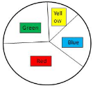 (ii)
(ii)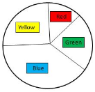 (iii)
(iii) 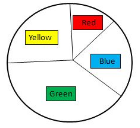
Solution:
Given information tells that the color and the number of students liked it. From the given data, Green is most liked by the more number of students. The second highest color liked by students is Yellow. The third highest color liked by students is Blue. Ans the fourth and last color liked by students is red. So, from the given images, the third image is satisfying the given data.
Therefore, the answer is (iii)
6. Answer the following questions.
(i) Which graph is used to compare data elements?
(ii) What is the collection of numbers gathered that provides some meaningful information or details?
(iii) What do we call when the data shows through pictures of objects?
(iv) On the scale of 1 unit length = 6 m, the bar of length 3 units will represent _______ m.
(v) Which graphs are used to represent the trend or change over time?
Solution:
(i) The Bar graph is used to compare data elements.
(ii) The Data is the collection of numbers gathered that provides some meaningful information or details.
(iii) We call it a Pictograph when the data shows through pictures of objects?
(iv) On the scale of 1 unit length = 6 m, the bar of length 3 units will represent 18 m.
(v) The Line graphs are used to represent the trend or change over time?
7. Observe the bar graph representing the number of ceiling fans sold in Mar month on different days of a week and answer the following.
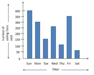
(i) On which day were the maximum number of ceiling fans sold and how many?
(ii) On which day were the minimum number of ceiling fans sold and how many?
(iii) On which day were 100 ceiling fans sold?
(iv) Is there any equal number of ceiling fans sold?
Solution:
Given that a bar graph representing the number of ceiling fans sold in Mar month on different days of a week.
(i) On Sunday, the maximum number of ceiling fans is sold. 450 machines are sold on Thursday.
(ii) On Saturday, the minimum number of ceiling fans is sold. 50 machines are sold on Thursday.
(iii) On Thursday, 100 ceiling fans were sold.
(iv) No. There is no equal number of ceiling fans sold on any day of the week.
8. If ⊗ represents 2 pencils, what do the following represent?
(i) ⊗⊗
(ii) ⊗⊗⊗⊗⊗⊗
(iii) ⊗⊗⊗
(iv) ⊗⊗⊗⊗⊗
(v) ⊗⊗⊗⊗⊗⊗⊗⊗
Solution:
Given ⊗ represents 2 pencils.
(i) ⊗⊗
⊗ (one cross circle) = 2 pencils
⊗⊗ (two cross circles) = 2 × 2 pencils = 4 pencils.
Therefore, the answer is 4 pencils.
(ii) ⊗⊗⊗⊗⊗⊗
⊗ (one cross circle) = 2 pencils
⊗⊗⊗⊗⊗⊗ (six cross circles) = 6 × 2 pencils = 12 pencils
Therefore, the answer is 12 pencils.
(iii) ⊗⊗⊗
⊗ (one cross circle) = 2 pencils
⊗⊗⊗ (three cross circles) = 3 × 2 pencils = 6 pencils
Therefore, the answer is 6 pencils.
(iv) ⊗⊗⊗⊗⊗
⊗ (one cross circle) = 2 pencils
⊗⊗⊗⊗⊗ (five cross circles) = 5 × 2 pencils = 10 pencils
Therefore, the answer is 10 pencils.
(v) ⊗⊗⊗⊗⊗⊗⊗⊗
⊗ (one cross circle) = 2 pencils
⊗⊗⊗⊗⊗⊗⊗⊗ (eight cross circles) = 8 × 2 pencils = 16 pencils
Therefore, the answer is 16 pencils.
9. 50 students were surveyed to find out about their favorite chocolate. The information collected has been tabulated. Observe the given data and draw a pie chart.
| Favorite Chocolate | Number of Students |
|---|---|
| Dairy Milk | 10 |
| Munch | 5 |
| KitKat | 30 |
| 5-star | 5 |
(i) Which is the most favorite chocolate of the students?
(ii) How many more students like Dairy Milk than Munch?
(iii) Which chocolates are liked by a similar number of students?
Solution:
Given 50 students were surveyed to find out about their favorite chocolate.
The pie chart for the given information is
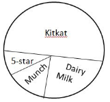
(i) KitKat is the favorite chocolate of the more students.
(ii) 5 more students like Dairy Milk than Munch.
(iii) Munch and 5-star chocolates are liked by a similar number of students.